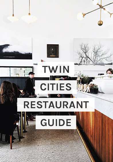
It’s finally come time to start sharing the Pinch of Yum Studio design (!!). If you’re wondering what I’m talking about, you can catch up with this post from August. Design is a whole lot of talking about design, like months of it, and all of a sudden it just takes shape overnight, which is what is happening right now. As I type, the drills are drilling along to Michael Bublé and Adele in the background. The IKEA kitchen is going in. (Not by my hands, though I’ve put together my fair share of IKEA projects for the studio, a favorite pastime of mine.) I’m excited to share the final reveal next month. But before we jump straight to the finale, I’m sharing the Pinch of Yum office renderings today. (NOTE: all sources and details will be posted in the final reveal posts.)
I first started doing these Photoshop renderings for Kev, 5+ years ago for our house, when he couldn’t see the vision inside my head. I hated doing them until I realized I made far fewer design mistakes with this method. So I’ve taken this skillset to the streets, to the Pinch of Yum studio.
Visual Direction
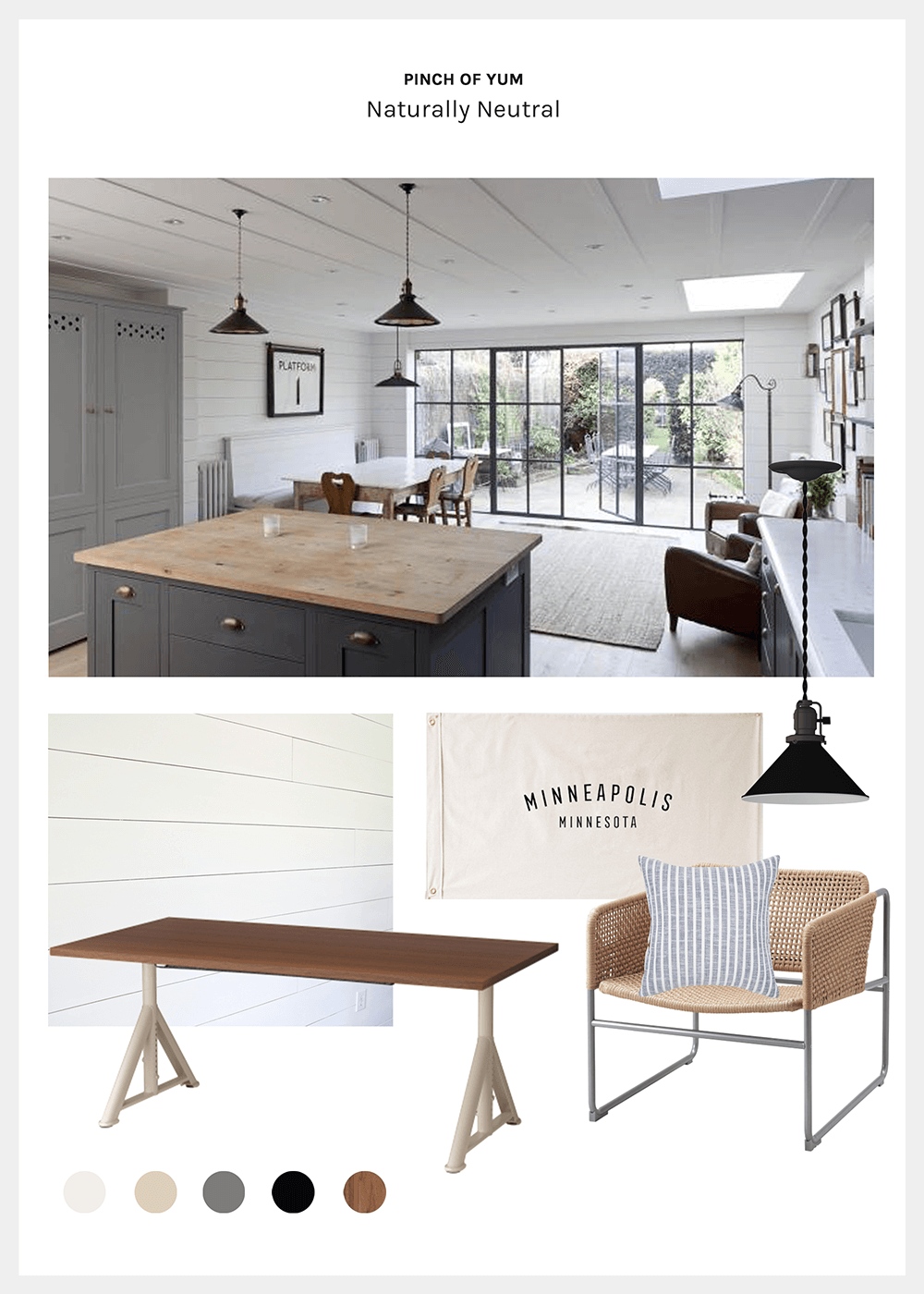
Let’s rewind back to the visual direction conversation for the studio. You may remember, I presented three mood boards or visual directions: Minnesota Cozy Cabin, Bright Scandinavian, and Naturally Neutral. You can see them here. Each had a bright, minimal aesthetic, with a slightly different bent. This process helped me to visually clarify what they meant by “bright and minimal.” It can mean a lot of different things. They ended up going the Naturally Neutral direction: Bright whites accented with blacks, greys, natural creamy creams, and warm wood tones.
This initial visual decision set the stage for all future design choices. One difficulty in design is having a whole lot of pretty choices at your fingertips. You can do anything. Choosing a specific visual direction gives you permission to say: I love this chair, for example, but it doesn’t fit with this particular aesthetic. Parameters in creativity are a beautiful thing. And we built in a lot, right from the beginning.
Office Renderings
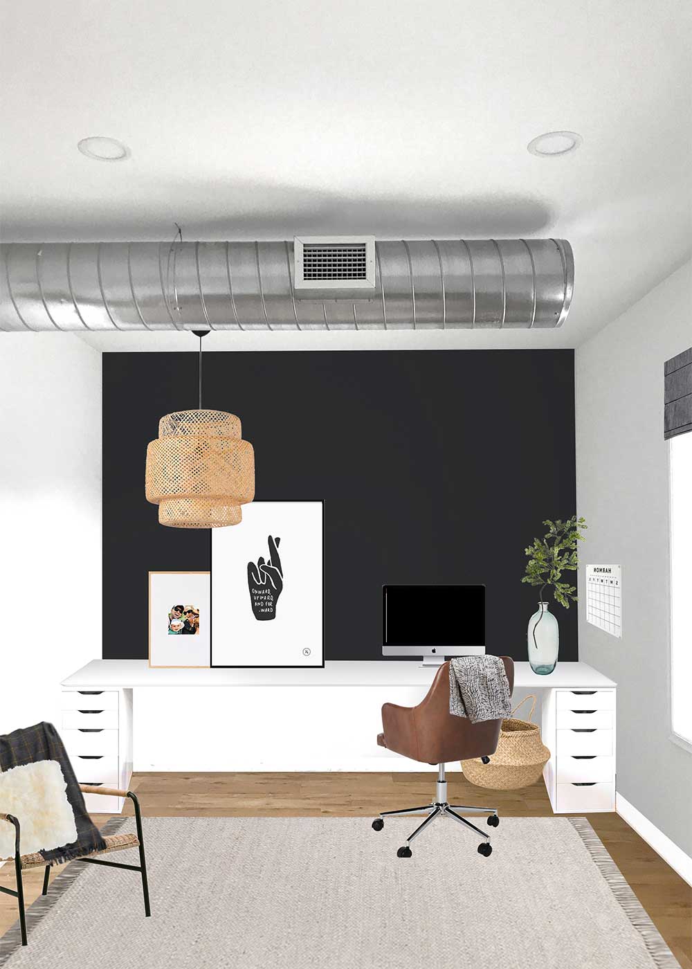
Below are the Photoshop renderings for each office space. You’ll see the original image the Photoshop file was built on and then the final rendering. What you’re not seeing are the rounds of revisions. (I’m saving those ideas for another project.) As we started each space, we considered the function of each room. How do you need this space to perform for you? I’d ask. Often times, a space needs to perform many different functions besides the obvious, and design is a great problem-solving tool for beautifully incorporating multiple functions. From there, we layered in the form, the pretty stuff, what you think of when you hear the word “design.” We then took these final renderings, which you’ll see below, to hire contractors and execute the design.
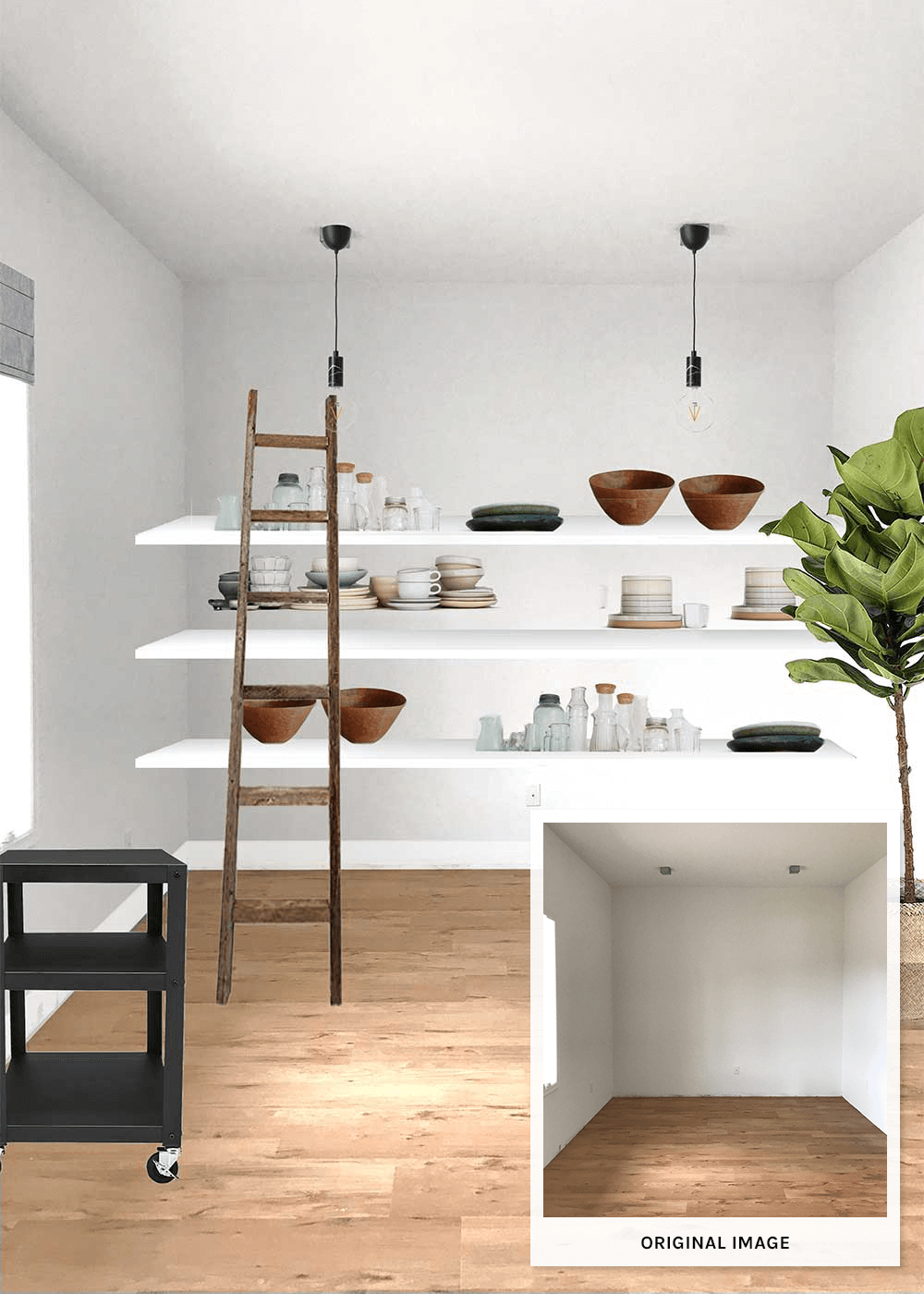
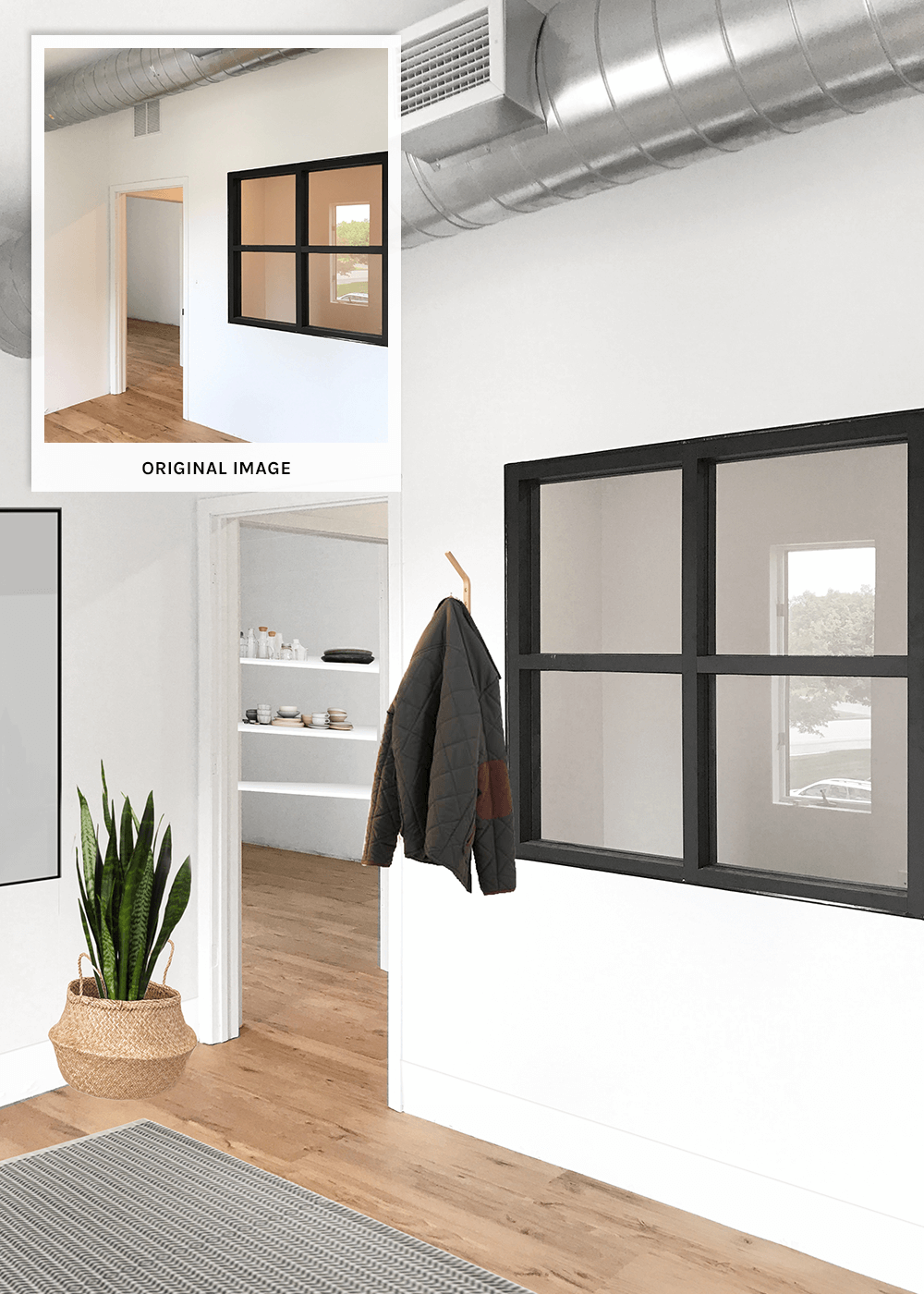
Office 1
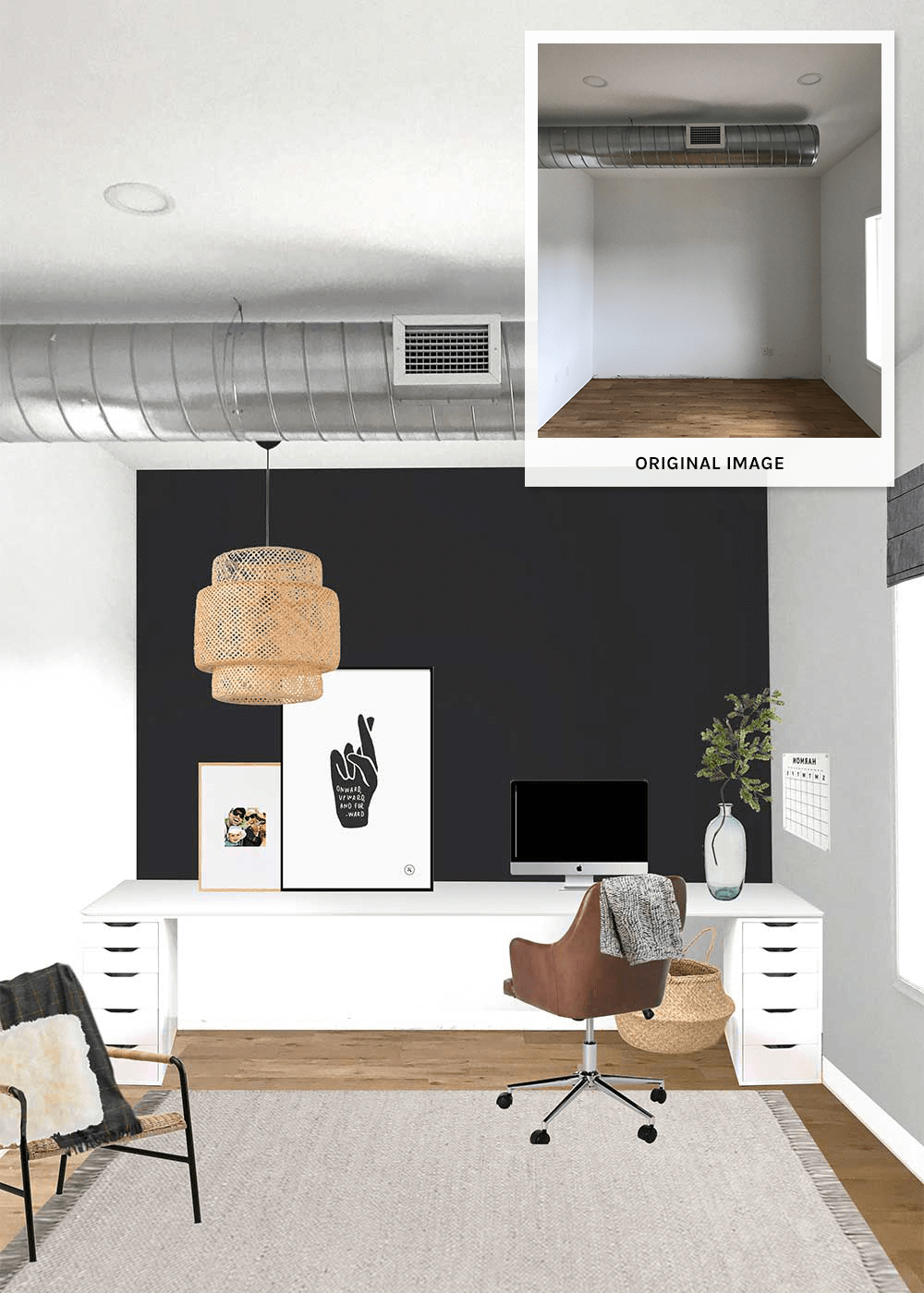
This is Lindsay’s office, the head creative director and founder of Pinch of Yum, a food blog with super doable and delicious recipes. She oversees recipe development, post writing, and photography (and a lot of other things). Her office space needed to efficiently perform each of these functions within a given day and/or week.
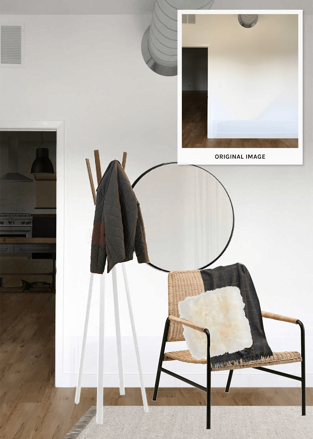
So, we separated her office into three zones: computer work, offline work, and photography studio. We added a huge desk to flank the work wall, weighting it with a coat of black paint, giving her multiple workspaces within one, an online and offline space. We gave her a small seating area for two-person meetings or occasional offline reading. On the other side of her office, we flanked the wall with shelving, to add both balance and storage. The open shelving was designed to house all her styling props while also standing in as decor. By the windows, she has a shooting cart for photography.
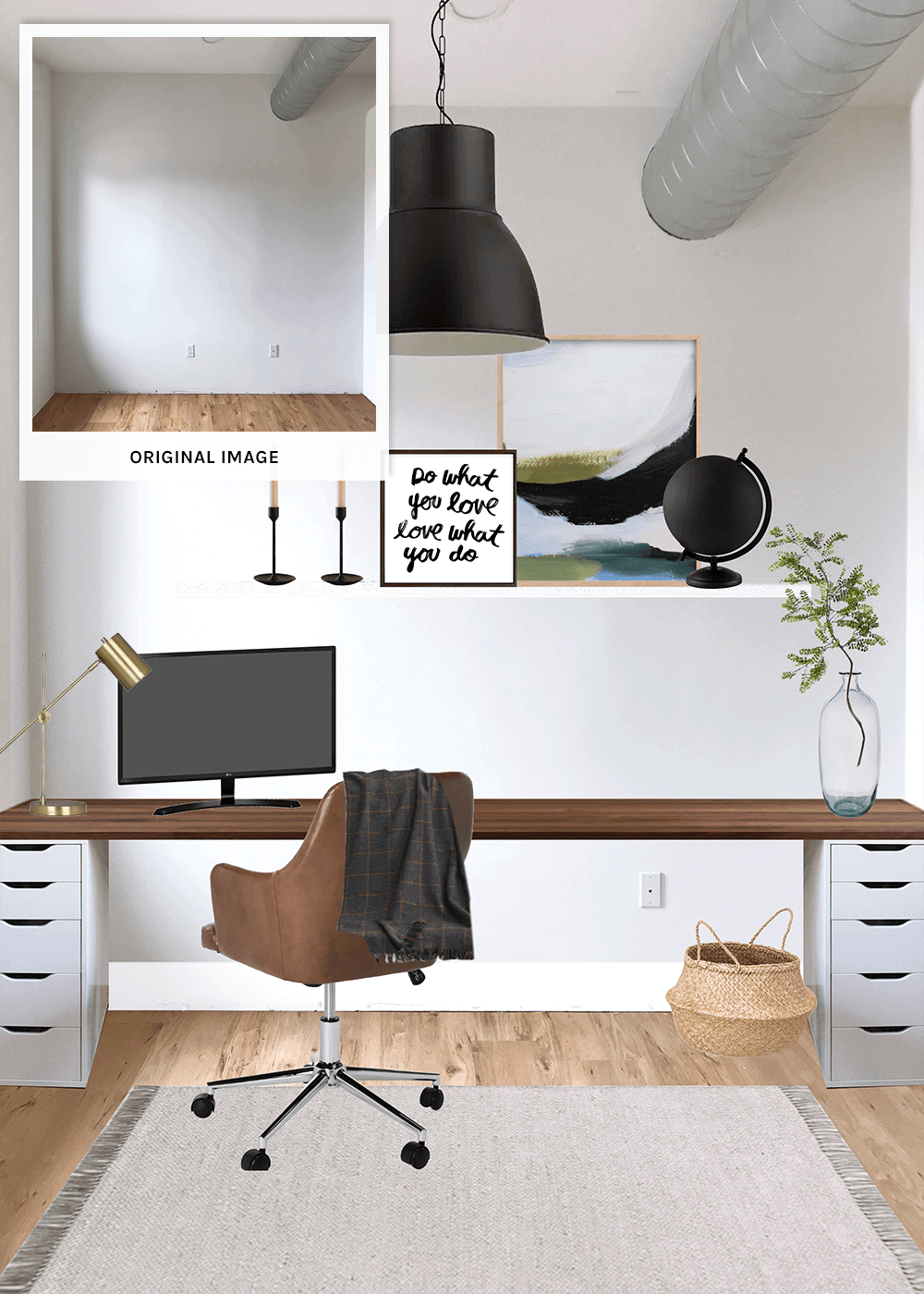
Office 2
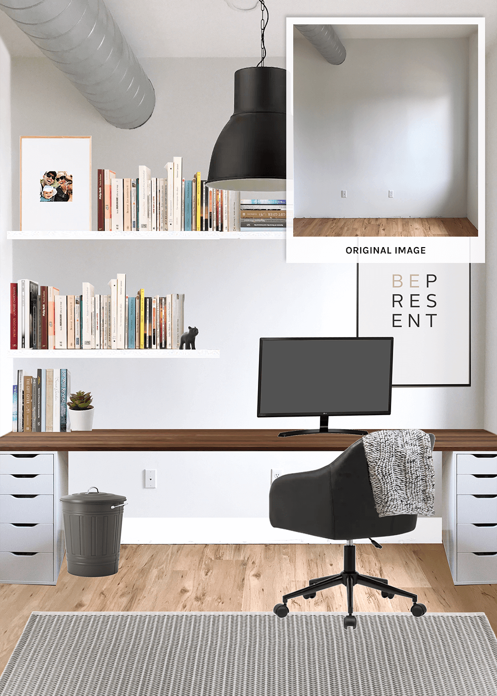
Welcome to Bjork’s office. Bjork manages the backend of Pinch of Yum, runs Food Blogger Pro, a comprehensive resource website and podcast for starting a blog, manages the plugins WP Tasty (the recipe plugin I use) and Nutrtifox, among other ventures. He wanted an online and offline working space, a space to read, and a space to think out loud.
So we separated his office into two zones—online and offline zones, a space for computer work and a space for non-computer work. We flanked a wall with a long desk, similar to Office 1, adding bookshelves to house the books he’d be reading in his offline space, which would also stand in as decor. On the other side of the room, we added a cozy reading area. We also added a large glass board where he can think out loud and capture his thoughts.
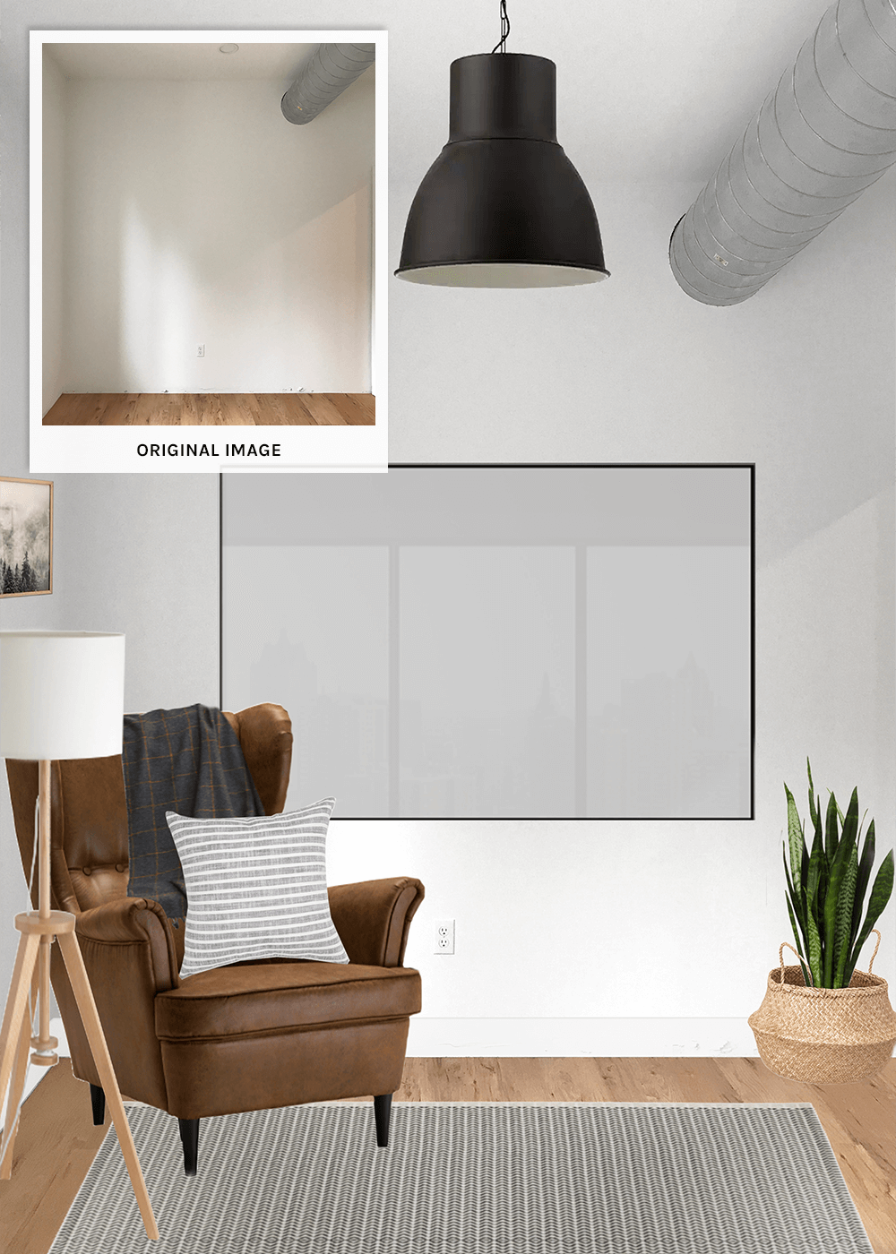
Bjork’s office came with an extra set of design stipulations in that it’s positioned in the middle of the studio, with an office mirrored on the other side of his wall. This is relevant information in that both offices have a huge interior window to allow light from the exterior windows to pass through. This meant we had to consider the design of both offices when designing his, since you can see into both at the same time. What we did in his office needed to be able to work in the next office over, with some slight modifications.
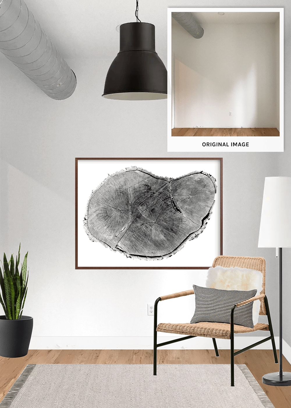
Office 3
This is Jenna’s office. Jenna is the communications manager and has worked on the team since I helped design their previous studio space several years ago. The bulk of Jenna’s day is online, at the computer, working on brand partnerships, internal and external communications, and social media support. For that reason, we prioritized her online workspace. Jenna’s office is a mirror to Office 2, Bjork’s office. To pick up the design of that office while matching the function of her space, we flanked the wall with the same long desk, went with a single shelf over her desk for decor, and added a meeting/seating area on the opposite side of the room.
Office 4
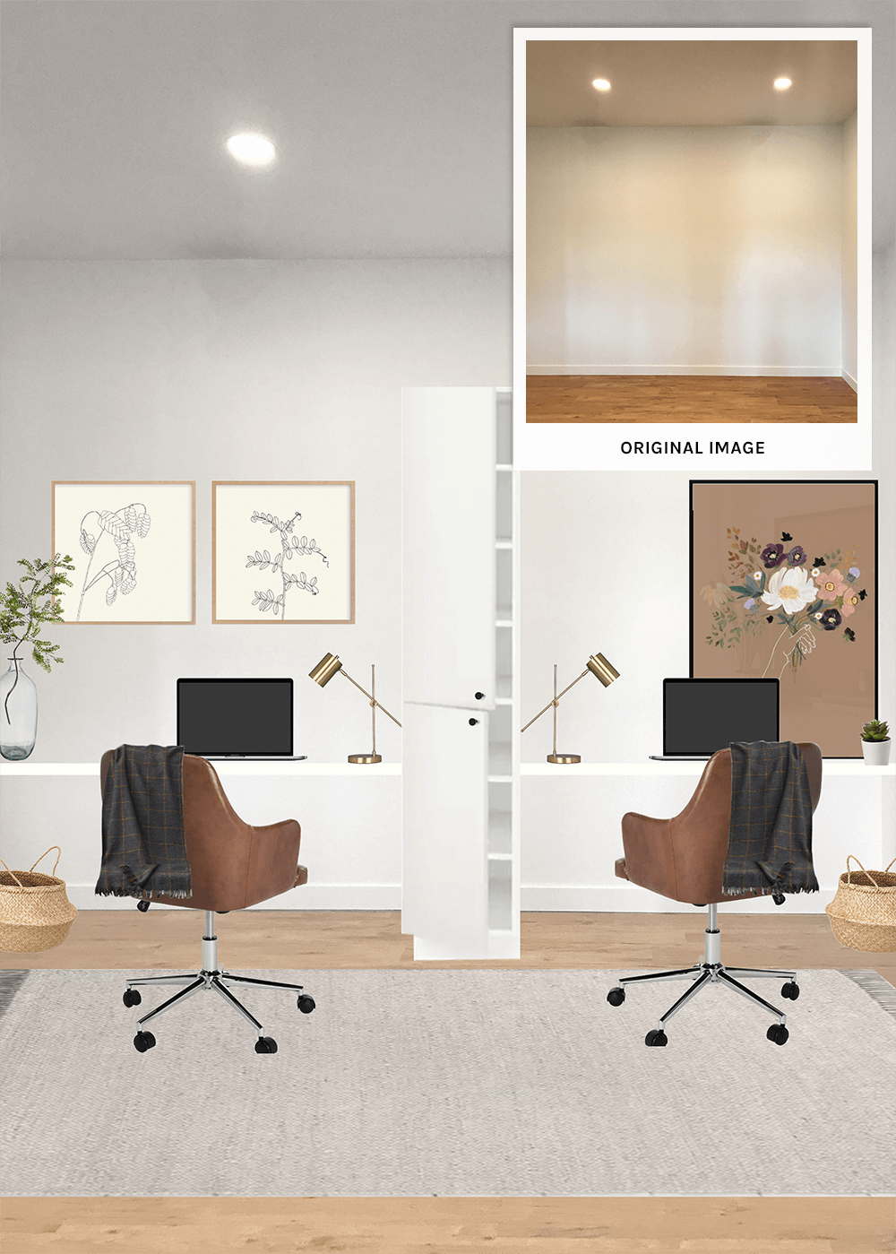
This is Eman’s office. Eman occupies this office full-time, working part-time with Pinch of Yum and part-time with Food Blogger Pro, with the majority of her work online. However, they needed this office to also be fluid, with the ability to accommodate an extra office space as needed. I came up with a simple solution to add storage and privacy at the same time. There’s also decent space on the other side of her office that we’re purposely leaving under-designed for now. Not having worked in this space prior to moving in, it’s hard to anticipate all the ways in which they’ll need the space to function. This extra space will be available when the specific need arises.
Up next: I’ll be sharing the Pinch of Yum renderings for the dining room and kitchen.


love the fingers crossed artwork…loook forward to your updating us as to decor! Great work!